
Layouts
Optional Reading
We will be using the Creating a GUI with JFC/Swing tutorial from Sun as a Reference source. You are not required to read the entire tutorial, I suggest you skim through it though to use a a supplement to what I give you here.
Layout Managers
Your first question is possibly "what the heck is a layout manager?" A layout manager is set of methods that are used by a container object to place and draw the components contained within that container. This allows for several key features:
Different layout managers have different goals in laying out their components. Within Swing, understanding how the layout managers work lets you design good applications.
When laying out components, strive for balance and symmetry in a window
Each container has a default layout, but that can be reset by calling setLayout() on the container. That being said, lets look at a few of the basic layouts used.
One other thing to remember is that for any Swing component, it can only be added to one container. If you try to add the component to a second container, it is removed from the first and then added to the second.
FlowLayout
FlowLayout is the simplest of all Layout Managers, and is the default for JPanel. It lays components out side by side, starting near the top of the container and working downward as each row is filled. Within each row, the components are, by default, arranged as evenly as possible around the center of the row.
Each component occupies its ideal (Preferred) space.
You can control the horizontal alignment of the components by passing in an optional value to the constructor. You can also control the horizontal and vertical spaces between the components the same way.
Download and open the Netbeans project flowlayout. When you run the file, the following window appears:
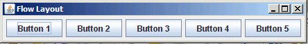
Try resizing the window and watch what happens to the buttons. The behavior you see when you make the window narrower is what makes FlowLayout a very risky layout manager to use, because this behavior can really mess up your whole window.
BorderLayout
BorderLayout is the default manager for JFrame, JWindow and JDialog. BorderLayout manages from one to five components
A border layout lays out a container, arranging and resizing its components to fit in five regions: north, south, east, west, and center. Each region is identified by a corresponding constant: NORTH, SOUTH, EAST, WEST, and CENTER.
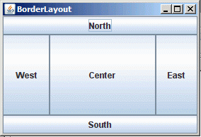
Components in North and South are always drawn in their preferred heights, North first, then South. Components in East and West are drawn in their preferred widths, East then West. The Center is given the remaining space, and is where a component is added if no location is specified.
BorderLayout()
Constructs a new border layout with no gaps between components.
BorderLayout(int hgap, int vgap)
Constructs a border layout with the specified gaps between components.
When adding components, use one of:
add(Component comp)
add(Component comp, Object constraints)
where constraints are BorderLayout.NORTH etc…
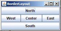
Download and open the Netbeans project borderlayout. When you run the application, the window first appears as follows:
If you enlarge the window, you can see the behavior of the BorderLayout as described above:
GridLayout
GridLayout is a fairly special purpose layout manager. The GridLayout class is a layout manager that lays out a container's components in a rectangular grid. The container is divided into equal-sized rectangles, and one component is placed in each rectangle.
There are four configurable parameters using the constructor:
GridLayout()
Creates a grid layout with a default of one column per component, in a single row.
GridLayout(int rows, int cols)
Creates a grid layout with the specified number of rows and columns.
GridLayout(int rows, int cols, int hgap, int vgap)
Creates a grid layout with the specified number of rows and columns with the specified gap between the rows and columns makes a set of grids of equal sizes and stretches the components in those cells to fit.
Download and open the Netbeans project gridlayout. When you run the app, you will see the following:
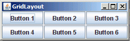
Resize the window and watch the behavior of the cells of the grid.
GridBagLayout
GridBagLayout is the layout people love to hate. The joke I used to use in my class is that GridBagLayout is like an old cartoon character, who is laying on the ground with one arm stuck up in the air. When you put down the one arm, a leg goes up, put down the leg, a different arm goes up....
GridBagLayout is a very powerful tool, but if you don't keep it "tied" down well enough...surprising things may happen.
GridBagLayout is also fairly IDE unfriendly, because it is from the earliest days of Java, its design isn't very "bean"-ish, or for that matter modern in any way.
The GridBagLayout class is a flexible layout manager that aligns components vertically and horizontally, without requiring that the components be of the same size. Each GridBagLayout object maintains a dynamic rectangular grid of cells, with each component occupying one or more cells, called its display area. Each component managed by a GridBagLayout is associated with an instance of GridBagConstraints that specifies how the component is laid out within its display area. Columns and rows may be different sizes and Components may be placed explicitly. This layout manager is complex, but often worth the effort.
When you add a component to a container using a GridBagLayout, you provide a GridBagConstraint object as the second argument that tells the layout manager how to handle this added component.
GridBagConstraints is an object with several attributes that can be set to affect how GridBagLayout works. Note that these are public attributes on the class!
constraint |
purpose |
| anchor | Used when the component is smaller than its display area to determine where (within the display area) to place the component. c.anchor = GridBagConstraints.NORTHEAST |
| fill | How the component will grow to occupy extra cell space c.fill = GridBagConstrains.BOTH; |
| gridheight, gridwith | Lets you specify (in grid elements) how big your component is.
GridBagConstraints.REMAINDER lets the component take up the remainder of the width/height of the grid c.gridheight = 2 |
| gridx, gridy | Specifies the cell at the upper left of the component's display area, where the upper-left-most cell has address gridx = 0, gridy = 0. Use GridBagConstraints.RELATIVE (the default value) to specify that the component be just placed just to the right of (for gridx) or just below (for gridy) the component that was added to the container just before this component was added. The following puts one button at (1,0) the next at (1,1) |
| insets | Specifies padding to be added around the outside of a Component c.insets = new Insets (1, 2, 3, 4) |
| ipadx, ipady | Added to a components minimum size when performing layout calculations. The actual size added is (2 x ipadx) or (2 x ipady), because the space is added to both sides c.ipadx = 2 |
| weightx, weighty | Controls how a component cell expands to occupy any extra space available.
Note that this is the cell, not the component (use fill constraint).
A value of 0.0 means the cell does not expand in that direction.
Values are arbitrary non-zero, behavior determined by the ratio of the cells weight to the sum of all weights in that row.
To make cell A expand twice as fast as cell B, let its value be twice that of B. c.weightx = 2.0 |
Typically, you would use a GridBagLayout as follows:
JFrame jf = new JFrame;
jf.setLayout(new GridBagLayout());
GridBagConstraints gbc = new GridBagConstraints();
gbc.gridx=0;
gbc.gridy=GridBagConstraints.RELATIVE;
jf.add(new JLabel("name:"), gbc);
jf.add(new JLabel("address:"), gbc);
jf.add(new JLabel("city:"), gbc);
gbc.gridx=1;
gbc.gridy=0;  // reset the y counter to 0
jf.add(new JTextField(10), gbc);
gbc.gridy=GridBagConstraints.RELATIVE;
jf.add(new JTextField(10), gbc);
jf.add(new JTextField(10), gbc);
Here we used the auto-incrementing feature of GridBagConstraints.RELATIVE.
A word of advice is in order. GridBagConstraints is a very good tool, but its learning curve is steep. If you have problems with the homework, ask for help early!
Download and open the Netbeans project gridbaglayout. When you run the application, the following window comes up:
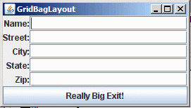
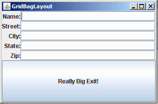
Resize the window and watch the behavior of the cells. Try changing/adding some constraints and see what happens. When I made this layout, I wanted the text fields to expand vertically, and the button to take up the rest of the space.
CardLayout
CardLayout takes a set of components (normally containers) and lays them out on top of each other like cards. Only one component is visible at a time. This layout manager is fairly primitive, and often you may use JTabbedPane instead which effectively replaces CardLayout for many purposes.
The true power of this container comes from a single method:
public void show(Container parent, String name);
It turns out that when you add components to the deck, you can supply a "name" as the optional constraint. So if I wanted to add a JPanel called "foopanel" with a label named "foo", I could use:
CardLayout layout = new CardLayout();
JPanel panel = new JPanel(layout);
panel.add(foopanel, "foo");
then, if I wanted to pop the foopanel object to the top of the deck I could just use
layout.show(panel, "foo");
This allows us to have a large stack of cards that are controlled by a list or a tree!
FormLayout, SpringLayout
These are newer layout mangers geared to supporting IDEs. GridBagLayout will do what these do if you are "hand maintaining code". If you are working with an IDE with a Swing plugin, you can use these automatically.